
This project reimagines driving information delivery to reduce distractions and enhance situational awareness. Having said that, it is important to note that this is a speculative project and not yet backed by extensive research.
Enhanced Driver Info System
Timeline
Feb-March 2024
Tools
Figma
Team
Individual
Project
Academic - Visual Design Course Project
OVERVIEW
Problem Statement
How can the traditional car dashboard be redesigned to reduce driver distraction, improve accessibility to critical information, and enhance overall road safety without overwhelming the user?
Scope and Limitations
This is a conceptual project intended to explore innovative visual design solutions, not yet backed by extensive research or usability studies. It was created as part of a Visual Design course.
However, I conducted an evaluation of existing designs to understand their limitations and identify opportunities for improvement. This helped shape the direction of the redesign by addressing common flaws in current dashboard interfaces.
APPROACH
Competitive Analysis
Before jumping into design, I spent time analyzing how modern in-car systems work, focusing on Tesla’s UI, BMW’s iDrive, and Mercedes’ MBUX. I broke down their strengths and weaknesses to understand what works well and what ends up creating friction while driving.

Opportunities for Improvement
While looking at how current systems work, I spotted a few common issues that could be improved to make driving more focused and less distracting.
-
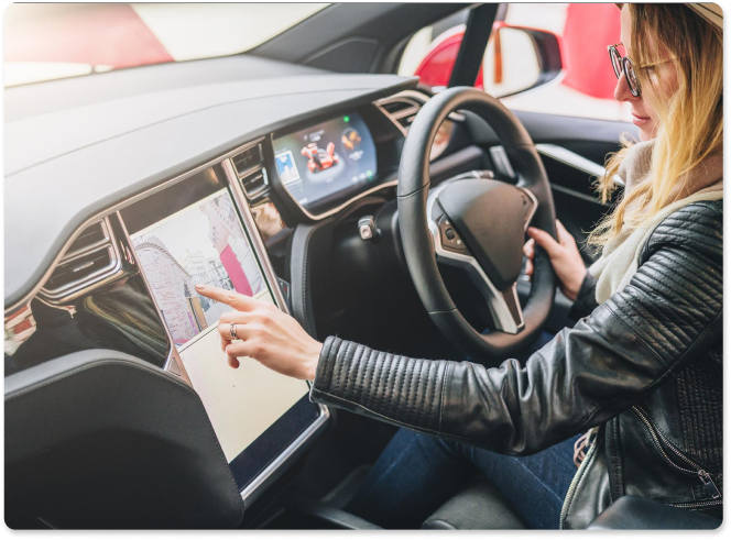
Touchscreen Dependency:
Many infotainment systems heavily rely on touchscreens. This requires drivers to look away from the road, potentially leading to distraction and decreased safety.
-
Complex User Interfaces:
Some systems have complex menus and interfaces that can be difficult to navigate quickly,
especially while driving.
-
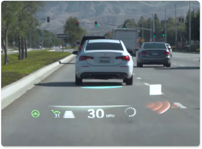
Limited Field of View:
AR HUDs offer a limited field of view, which can restrict the amount of information displayed without obstructing the driver’s natural view.
-
Distraction Potential:
Poorly designed AR systems can be distracting if they present too much information or if the information is not intuitively placed.
PROTOTYPES
Brainstorming Solutions
To create an intuitive and visually appealing driver information system, I set the following design goals:
-
Minimal Distraction Interface
Ensure a clean, modern & clutter-free layout to maintain focus on the road.
-
Consistent Visual Hierarchy
Prioritize information to ensuring quick access to essential details.
-
Seamless Integration with AR:
Provide navigational guidance without obstructing the natural view.
Paper Prototypes
I started off with quick paper sketches to explore layout ideas and how the different screens could work together. This helped me experiment freely without getting caught up in visuals too early. I tried out a few variations to see what felt most intuitive from a driver's perspective.


Wireframe
Once I had the direction in mind, I built one digital wireframe that focused on a two-screen setup, with a center section designed to look like a traditional analog-digital hybrid. The goal was to keep that familiar feel for drivers, build a strong visual hierarchy, and guide their eyes to the most important info, like speed, car mode, and signals, without making it feel like just another touchscreen-heavy interface.

INSPIRATION
Visual Direction
I pulled ideas from modern car dashboards, AR navigation, and clean digital interfaces. I wanted a sleek, minimal look that keeps things clear and easy to read. The muted colors and bold text help keep distractions low. I focused on a balance of style and practicality


DESIGN
Style Guide
To create a cohesive and intuitive interface for the Enhanced Driver Info System, I designed a comprehensive style guide that balances functionality with a visually appealing look. Here's how each element was crafted to enhance user experience.
Color Palette
I chose a high-contrast color palette that is easy to read at a glance without overwhelming the senses. Each color serves a clear purpose. Red is the flag for urgent stuff; green means everything's smooth sailing. And for those 'keep an eye on this' moments, I'm sprinkling in some yellow and orange.
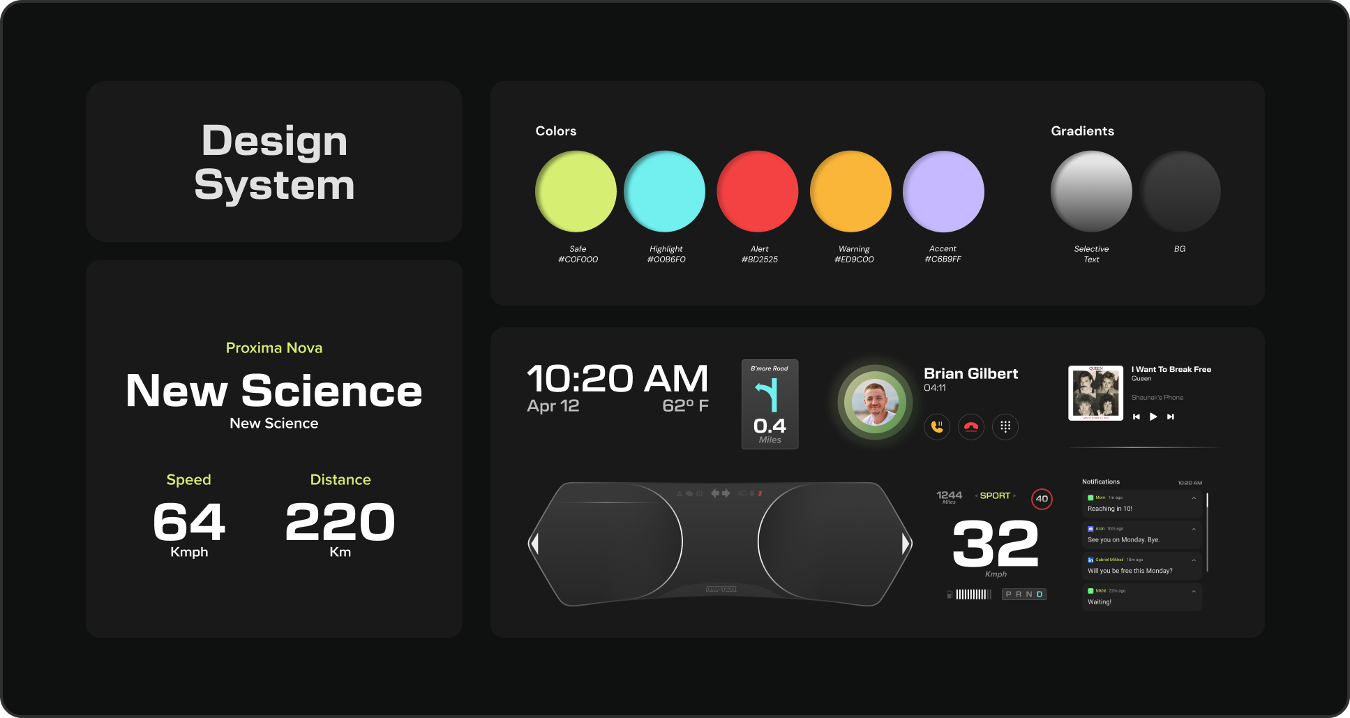
The colors are deliberately vibrant to ensure visibility under various lighting conditions, including bright sunlight and night-time driving. The colors are deliberately vibrant to ensure visibility under various lighting conditions, including bright sunlight and nighttime driving.
Typography
I opted for a combination of:
-
New Science for numerical data:
This font is bold and clear, perfect for showing speed, distance, and other critical information at a quick glance.
-
Proxima Nova for text:
Clean and modern, ensuring legibility without distracting the driver.
FEATURES
Solving with Design
To create a cohesive and intuitive interface for the Enhanced Driver Info System, I designed a comprehensive style guide that balances functionality with a visually appealing look. Here's how each element was crafted to enhance user experience.
🏠 Home State
Drivers need quick access to basic info without digging through menus.
Solution: I placed essentials like time, weather, and music overview in a single glanceable screen to reduce unnecessary interaction. It helps drivers stay informed without diverting focus.

🧭 AR Navigation
Traditional navigation can feel disconnected from reality with a chance of error.
Design Decision: I combined GPS with AR overlays so that directions appear directly on the road view. It improves spatial awareness and makes decision-making easier at intersections.

📞 Phone Call
Handling calls can be risky while driving.
Design Decision: With caller ID, face photo, and steering wheel call controls, this design ensures drivers don’t need to look away or touch screens to respond.

🔔 Messages and Notifications
Notifications can be overwhelming and distracting.
Design Decision: I limited on-screen message previews to a single line with voice readouts triggered via steering wheel. It keeps communication subtle and hands-free.


🔊 Music/Media
Media controls are often buried or too interactive.
Design Decision: A clean layout plus full steering wheel control means users can manage playback without reaching out or shifting attention.

👀 Blind Spot Camera View
Changing lanes can be stressful, especially with limited visibility.
Design Decision: The system auto-switches to a camera view when signaling, showing side and rear visuals. It enhances safety and confidence in real-time.

DESIGNING
High Fidelity
The final design brings together all the elements—structured layouts, intuitive interactions, and a visually cohesive interface to create an enhanced dashboard.
IMPACT
Making a Difference
These features were shaped by the gaps I found during competitive analysis. Each one is a response to a specific problem, from screen overload to navigation clarity, designed to make the driving experience simpler and safer.
-
Minimized Distractions
Essential info like navigation stays in natural line of sight.
-
Augmented Navigation
Directions overlay onto real-world footage for effortless navigation and better low-light visibility without obstructing the driver’s view.
-
Hands-Free Communication
Calls and message previews keep drivers connected safely.
-
Tactile Steering Controls
Essential functions like media, calls, and notifications are managed via steering wheel buttons, reducing touchscreen reliance.